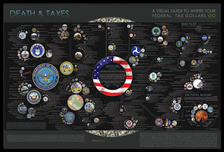
I have been reading more about data visualization tools and techniques recently and came across a very cool data "picture" created to show how the US government's budget breaks down. Thinking about the nitty gritty of the federal government's budget it seems fairly boring
but when the idea is presented in a visual way, it suddenly becomes a lot more interesting.
Jesse Bachman, a graphic designer, created the picture below. If you go to his website, you can see the poster in more detail.
